Did you know? Prehistoric humans made the first known paints with a mix of soil, minerals, animal fat, chalk, and charcoal. This 40,000-year-old recipe yielded pigments that were used for cave paintings and other forms of expression, consisting of colors in red, yellow, brown, black, and white. As such, this combination of warm and earthy hues can be thought of as the earliest known color palette.
Today, scientists estimate that it’s possible for the human eye to distinguish about one million different colors, resulting in a staggering number of color combinations. Out of this near-infinite mix, certain hues catch our eye, and we surround ourselves with colors that hold special meaning to us. In our homes, in our fashion choices, and even in the businesses and brands we are drawn to, color palettes have a powerful ability to engage and inspire.
Whether you’re looking to revamp your home with a color palette you’ll love or simply want to dive deeper into the world of color, we’ve created this guide to get you started. Below, you’ll find an introduction to color theory, a guide to the most common types of color palettes, and tips for smoothly integrating color palettes into your home.

Let’s begin by defining some terms that will form the building blocks of our exploration into color.
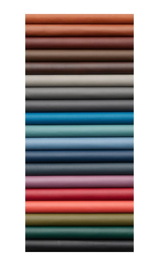
Color palette: A collection of colors that forms a cohesive design theme. A palette can have as few as 2 colors, or as many as a dozen or more – often it will comprise around 3-6 colors.
Color wheel: Resembling a rainbow in the shape of a circle, a color wheel shows primary, secondary, and tertiary colors.
Did you know? Isaac Newton created an early color wheel in 1666, after his experiments with prisms showed how light can be broken into a spectrum of colors.
Primary colors: Red, blue, and yellow. A color is primary when you can’t create it by mixing other colors.
Secondary colors: Orange, green, and purple. These are created by mixing 2 primary colors.
Tertiary colors: A mix of a primary color and the secondary color next to it on the wheel. Names for tertiary colors can vary, but often include teal, gold, indigo, magenta, and others.
Composite colors: A mix of 2 or more colors anywhere on the wheel, e.g. brown created from blue and orange. All secondary and tertiary colors are composite, but not all composite colors are secondary or tertiary. As such, not all composite colors appear on the standard color wheel.
Black & white: Traditionally not considered “colors” in the strict sense, black and white are still important to mention. They’ve been conceptualized as the absence of color, or as all colors together. (That is, a black object absorbs all wavelengths of colored light, while white light contains all wavelengths of color.)
Next, we’ll cover the terms, “hue,” “tint,” “shade,” and “tone” – while these are often used interchangeably, they have more specific meanings in color theory.
Hue: A color in its purest form, without white or black added.
Tint: A hue with white added, e.g. pink is a tint of red.
Shade: A hue with black added, e.g. burgundy is a shade of red.
Tone: A hue with grey added, e.g. terracotta red is a tone of red.
In art, design, and colloquial speech, tints may also be called pastels, shades of certain colors may be called jewel tones, and some tones and shades may be called earth tones or neutrals – bringing us to our last set of definitions, on color temperature.
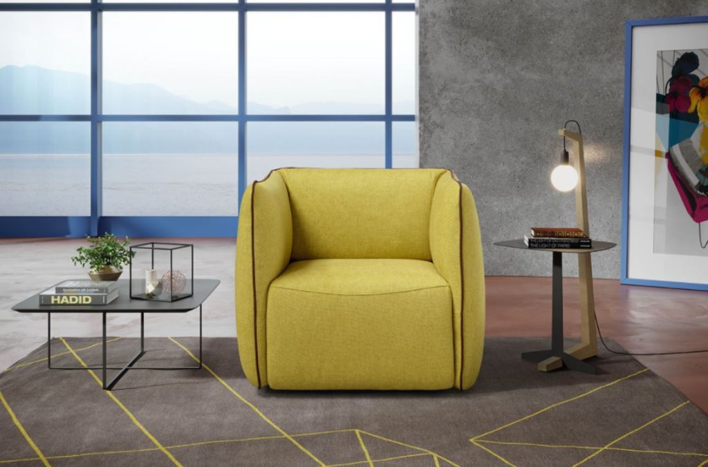
Warm colors: Reds, oranges, and yellows, historically associated with fire and sunlight.
Cool colors: Blues, greens, and purples, associated with water and ice.
Neutrals: White, black, and grey, as well as most browns, beiges, and ivories. These have a more muted look and typically don’t appear on the traditional color wheel.


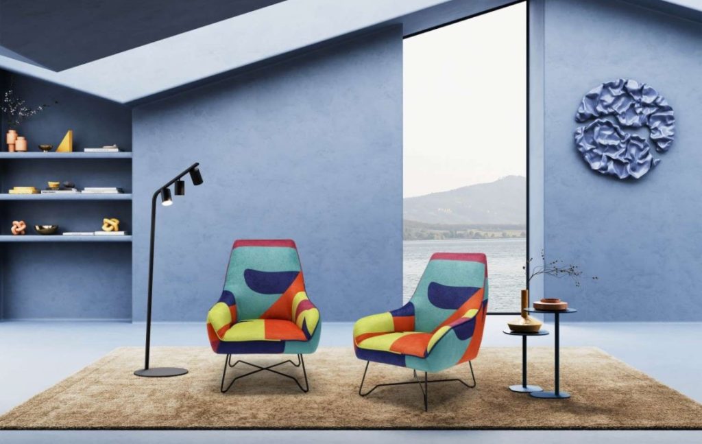
Next, we cover the 6 most common types of palettes. Whether your goal is inspiration, exploration, or refinement, a spectrum of possibilities awaits. As a note, neutrals can, and commonly are, added to any of these color palettes to ground them out.
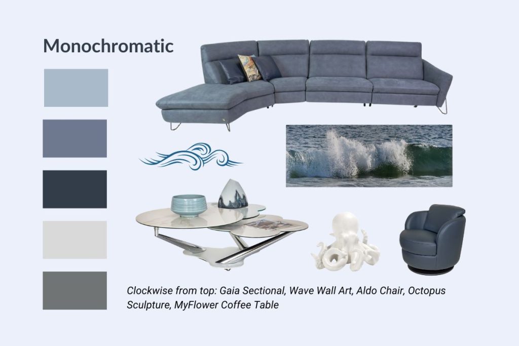
Monochromatic: Uses a single color, including tints, shades, and tones, e.g. classic blue, navy blue, and baby blue.
Analogous: Uses colors that are next to each other on the color wheel, e.g. green, teal, and blue, or pink, peach, and yellow.
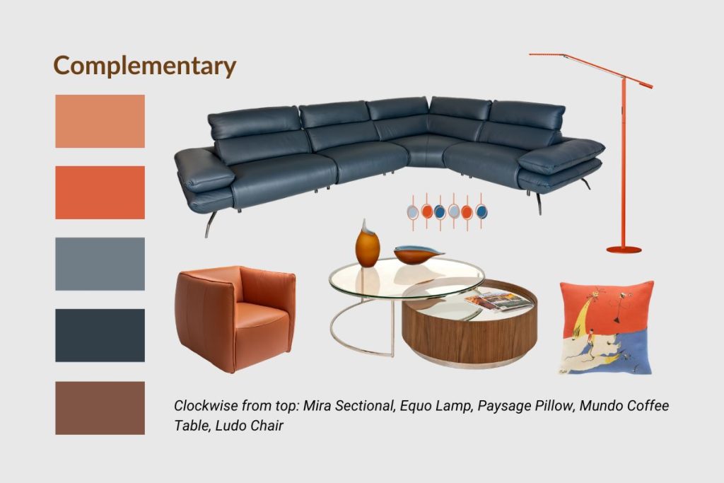
Complementary: Uses colors that are opposite each other on the wheel, e.g. blue and orange.
Split complementary: For this palette, take one color, determine its opposite on the wheel, then take the two colors on either side of its opposite, e.g. pink, lime green, and teal.
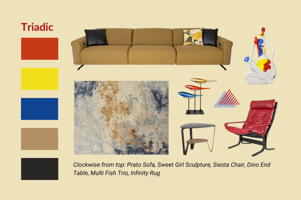
Triadic: Consists of three colors equidistant from each other on the wheel, e.g. red, blue, and yellow.
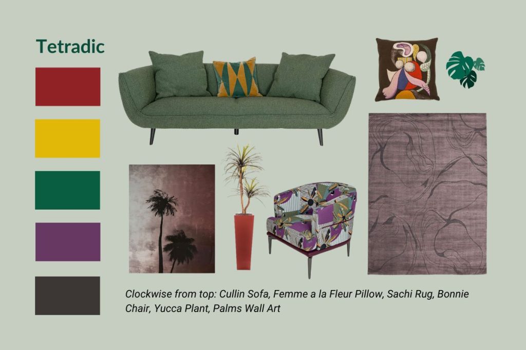
Tetradic: Four colors consisting of two sets of complementary colors, e.g. red, yellow, green, and purple.
The following strategy can help if you’re simply looking for a place to begin:
Finally, when it comes to the pragmatic aspects of choosing a color palette that sparks joy for you and works for your interior, keep the following in mind.
Work with what you have.
Think of elements of your space that you want to keep or cannot change. For instance, perhaps you’re a homeowner and want to show off an heirloom blue velvet sofa in your living room. Or perhaps you’re in a rental and can’t alter the finish of floors, cabinets, or walls. These can impose some limits on what color palettes will work, but it can also help narrow down your choices and encourage creative solutions.
Neutrals are key.
Most of the time, neutrals are an essential ingredient of interior color palettes. While more vibrant hues may hold the starring role, neutral colors offer a soothing backdrop and a sense of balance. In general, 1-3 neutrals will work well in most color schemes (though some people find that they prefer an all-neutral design theme). As an additional tip, pay attention to the nuances of warmer vs cooler toned neutrals – a creamy off-white or a taupe with a hint of orange creates a subtly different feel from a slate grey or a dark navy.
Consider color proportions.
In interior design, the 60-30-10 Rule states that one color (often, though not always, a neutral) should compose roughly 60% of a space, with 30% dedicated to one or more accent colors, and 10% to secondary accent(s). By staggering proportions in this way, the dominant color can anchor and give cohesion to a room, while the accents add points of interest. Though many people find this rule helpful, you can also experiment with different proportions to find what speaks most to you.
Consider the effects of light.
Because color is inextricably tied to light, the amount and type of light a room gets can influence how colors appear. Make a note of things like how much natural light a room gets, what direction the windows face, and what kind of artificial lighting is within the space. If a room does not get much natural light, a color palette with lighter hues and tints can produce a brighter feel, though the same palette may look washed out in a room with abundant natural light. On the flipside, a dark-toned palette is likely to stand out crisply in a room that gets lots of sun, but risks making a more dimly lit room feel closed-in.
Also remember that in terms of color temperature, morning light appears whiter and cooler compared to afternoon light, which is more golden. Artificial light also comes in a range of color temperatures. If possible, get color swatches and look at them under different kinds of light – this may reveal undertones of each color that change how you feel about them.
Use technology and expert advice to guide you.
Whatever stage you’re at in your design journey, there are a wealth of tools and people out there who can point you in the right direction. Online color palette tools can help organize your ideas, while floorplanning software – offered on the Copenhagen site – allows you to create a virtual replica of a room and visualize different possibilities. If you’re seeking more strategic guidance, our experienced interior designers are here to help. From small tweaks to furnishing a full renovation, our team is here for you at every step.
Listen to your heart.
Don’t worry if your palette doesn’t perfectly conform to one of the ones above. It’s your home, so you get to prioritize what feels aesthetically and emotionally satisfying, and what colors best align with the function and intention of a space.
Though color psychology states that certain colors invoke certain emotions, such as red and orange for energy and excitement, or blue and green for calm and renewal, color is highly subjective as well. For instance, black may feel gloomy to some, but sophisticated to others. Some people adore the color pink, while others find it off-putting.
For shared spaces, try to find common ground in terms of color preferences – more individualized rooms can exhibit more creative freedom. At the end of the day, choose colors that bring joy to you and your household members, and that make you feel at home in your space.